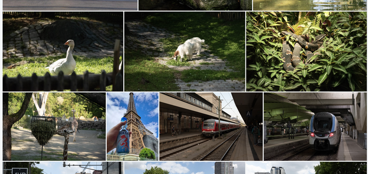
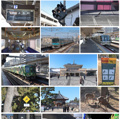
Back in the day, I used to upload my photos to Flickr. One thing I always appreciated about their product is their photo grid.

It is visually interesting, space-efficient and gapless, even when showing photos in different orientations and aspect ratios, by varying the height and number of items on each row.
However, Flickr has changed owners and monetization strategies multiple times over the years, and I really do not want to pay for yet another subscription, so I ended up uploading far fewer photos over the last two years or so. My recent photo series on Japan has been the first major attempt to share photos in over two years.
I would honestly like to use my blog more for this sort of stuff. I have more than enough webspace for it, after all. I have already built some infrastructure for automating things like thumbnail generation so I can just dump my JPEGs into the blog’s git repository and be done with it. However, one thing I wanted was a photo stream like Flickr’s.
You can see the results of my work here. In this post, I’d like to explain how it works.
First off, my requirements.
- The gallery should automatically ingest all photos on the website, whether they are in
/assetsor inside a post’s asset bundle. - There should be a mechanism for blacklisting photos, e.g. to filter out screenshots like the one above
- All photos should be displayed uncropped and in their original aspect ratio
- It should look good, with every row being the same width
Just dumping all images into a single HTML document is really easy to do with Hugo. But making it look nice and consistent regardless of image sizes needs some more work. My first approach was to look at pure CSS Flexbox approaches, but those can’t really do the heavy lifting required to fulfil criteria 3 and 4. At least, none of the solutions I could find on Google were capable of doing that, and I am by no means a CSS expert. It is by far my least favourite part of web design.
Thus, I needed to dive into Hugo’s template system, in order to do all of the math required to create a proper layout during the build process for my blog.
First off, we’ll need a Markdown document to define the page for the gallery at content/gallery.md.
---
title: "Gallery"
url: "/gallery"
layout: "gallery"
params:
    exclude:
        - images\/theme\/*
---
This file consists only of a front matter, as the entire content will be defined in the template file later. Note that params.exclude allows you to provide a blacklist. You need to use regex here, as I could not find a way to evaluate globs within the Hugo API.
Then, we obviously need a template. This goes into layouts/gallery.html (inside your site’s root folder, not inside themes!)
{{- define "_partials/subdivide-list.html"}}
    {{ $input := .list}}
    {{ $itemsPerRow := .itemsPerRow }}

    {{/* Semantics for Collection.append are different when working on empty vs. non-empty collections.
       * See https://discourse.gohugo.io/t/adding-a-slice-to-a-slice-as-a-single-item/56628/2
       * As a workaround, we're adding a "sacrificial" zeroth item to the start of the list and then remove
       * it before the return statement.
       */}}
    {{ $output := slice $input }}

    {{/* Maths in Hugo is too much of a pain for me right now, so we'll just do what is effectively an endless loop and bail
       * when done. This will obviously break if you have more than 10000000 * $itemsPerRow images but I'd say, don't worry about it.
       */}}
    {{ range 10000000 }}
        {{ if gt (len $input) $itemsPerRow }}
            {{ $row := first $itemsPerRow $input }}
            {{ $input = after $itemsPerRow $input }}
            {{ $output = $output | append $row }}
        {{ else if eq (len $input) 0 }}
            {{/* avoid having a last "slice" that has zero items */}}
            {{ break }}
        {{ else }}
            {{ $output = $output | append $input }}
            {{ break }}
        {{ end }}
    {{ end }}

    {{ $output = after 1 $output }}
    {{ return $output }}
{{- end}}

{{- define "_partials/gallery-blacklist.html" }}
    {{ $input := .input }}
    {{ $patterns := .patterns }}
    {{ if eq $patterns nil }}
        {{ $patterns := slice }}
    {{ end }}

    {{ $output := slice }}

    {{ range $input }}
        {{ $item := . }}
        {{ $href := .href }}
        {{ $exclude := false }}
        {{ range $patterns }}
            {{ if findRE . $href 1 }}
                {{ $exclude = true }}
                {{ break}}
            {{ end}}
        {{ end }}

        {{ if eq $exclude false }}
            {{ $output = $output | append $item }}
        {{ end }}
    {{ end }}

    {{ return $output }}
{{- end}}

{{- define "_partials/gallery-thumb.html"}}
    {{ $path := .href }}
    {{ $image := .image }}
    {{ $height := .height }}
    {{ $width := .width }}

    {{/* We could theoretically create a thumbnail that exactly matches the intended display size. However, that would
       * require regenerating the images every time they shift between rows, creating a mess in the git repo and invalidating
       * browser caches. Thus, it's better in my opinion to generate a somewhat oversized thumbnail and let the browser handle it.
       */}}
    {{ $format := "360x360 Lanczos" }}

    {{ with $image }}
        {{ with .Exif }}
            {{ with .Tags.Orientation }}
                {{ if or (eq . 7) (eq . 8) }}
                    {{ $format = "360x360 Lanczos r90" }}
                {{ else if or (eq . 5) (eq . 6) }}
                    {{ $format = "360x360 Lanczos r270" }}
                {{ end }}
            {{ end }}
        {{ else }}
            {{ warnf "No EXIF data in image %s" $path }}
        {{ end }}

        {{ $thumbnail := .Fit $format }}
        <a href="{{ $path }}" target="_blank">
            <img src="{{ $thumbnail.RelPermalink }}" height="{{ $height }}" width="{{ $width }}" class="gallery-thumb" />
        </a>
    {{ else }}
        {{ errorf "Image file not found: %s" $path }}
    {{ end }}
{{- end }}

{{- define "_partials/gallery-row.html" }}
    {{ $images := .images }}
    {{ $availableWidth := .availableWidth }}

    {{ if eq $images nil }}
        {{ errorf "Parameter .images missing!" }}
    {{ end }}

    {{ if or (eq $availableWidth nil) (eq $availableWidth 0) }}
        {{ errorf "Available width is nil or zero" }}
    {{ end }}

    {{/* We will now scale the images to a reference height, get the width of the entire row at
       * that hypothetical reference height, and use that theoretical width to determine the
       * *actual* height we need to scale to.
       *
       * The initial value does not actually matter.
       */}}
    {{ $targetHeight := 1000.0 }}
    {{ $realWidth := 0 }}
    {{ range $images }}
        {{ $imgWidth := .image.Width }}
        {{ $imgHeight := .image.Height }}

        {{/* If the image is portrait, we need to flip height and width for the math to check out */}}
        {{ with .image.Exif }}
            {{ with .Tags.Orientation }}
                {{ if or (eq . 5) (eq . 6) (eq . 7) (eq . 8) }}
                    {{ $tmp := $imgWidth }}
                    {{ $imgWidth = $imgHeight }}
                    {{ $imgHeight = $tmp}}
                {{ end }}
            {{ end }}
        {{ end }}

        {{ $scaleFactor := div $targetHeight (float $imgHeight) }}
        {{ $realWidth = add (mul $imgWidth $scaleFactor) $realWidth }}
    {{ end }}
    {{ $heightScaleFactor := div $availableWidth $realWidth }}
    {{ $targetHeight := mul $targetHeight $heightScaleFactor }}

    <div class="gallery-row">
        {{ range $images }}
            {{ $imgWidth := .image.Width }}
            {{ $imgHeight := .image.Height }}

            {{/* If the image is portrait, we need to flip height and width for the math to check out */}}
            {{ with .image.Exif }}
                {{ with .Tags.Orientation }}
                    {{ if or (eq . 5) (eq . 6) (eq . 7) (eq . 8) }}
                        {{ $tmp := $imgWidth }}
                        {{ $imgWidth = $imgHeight }}
                        {{ $imgHeight = $tmp}}
                    {{ end }}
                {{ end }}
            {{ end }}

            {{ $scaleFactor := div $targetHeight (float $imgHeight) }}
            {{ $width := int (mul (float $imgWidth) $scaleFactor) }}
            {{ $height := int (mul (float $imgHeight) $scaleFactor) }}
            {{ $parameters := dict "href" .href "image" .image "width" $width "height" $height }}
            {{ partial "gallery-thumb" $parameters }}
        {{ end }}
    </div>
{{- end }}

{{- define "main" }}

{{/* Settings*/}}
{{ $imagesPerRow := 3 }}
{{ $availableWidth := 700 }} {{/* content width minus space used by margins/padding between images. Adapt to your theme if necessary */}}

<h1>Gallery</h1>

{{/* Get images from global resources (/assets and all directories mounted to it) */ -}}
{{ $images := slice }}
{{ range resources.Match "images/**.jpg" }}
    {{ $image := resources.Get .}}
    {{ $dict := dict "href" .RelPermalink "image" $image }}
    {{ $images = append $dict $images }}
{{ end }}

{{/* Get images from page bundles */ -}}
{{ range site.RegularPages }}
    {{ $page := . }}
    {{ range .Resources.Match "**.jpg" }}
        {{ $image := $page.Resources.Get . }}
        {{ $dict := dict "href" .RelPermalink "image" $image}}
        {{ $images = append $dict $images }}
    {{ end }}
{{ end }}

{{/* process blacklist */}}
{{ $images = partial "gallery-blacklist" (dict "input" $images "patterns" .Params.exclude)}}

{{/* Sort by date */}}
{{ $images = sort $images ".image.Exif.Tags.DateTimeOriginal" "desc" }}

{{/* Subdivide into individual arrays representing individual rows*/}}
{{ $subdivisionSettings := dict "list" $images "itemsPerRow" $imagesPerRow }}
{{ $images = partial "subdivide-list" $subdivisionSettings }}

<div class="gallery">
    {{ range $images }}
        {{ $parameters := dict "images" . "availableWidth" $availableWidth }}
        {{ partial "gallery-row" $parameters }}
    {{ end }}
</div>

{{- end }}{{/* end main */ -}}
I’ve tried to comment the code reasonably well.
You will need to fiddle around with this section if you are not using PaperMod as your theme:
{{/* Settings*/}}
{{ $imagesPerRow := 3 }}
{{ $availableWidth := 700 }} {{/* content width minus space used by margins/padding between images. Adapt to your theme if necessary */}}
We also need some CSS. This will obviously be highly dependent on your theme but here is the relevant section from my assets/css/extended/global.css:
.gallery-thumb {
  display: inline !important;
}
Then, we can just add a link to /gallery in the menu bar and it should work! This is how it looks:

One remaining issue is that the layout breaks on devices with small screens - everything still technically works, but it just doesn’t look great. I do not really want to deal with this, to be honest, because it is going to be a mess to solve this purely in CSS. Again, I am not a CSS person.
Anyway, I am very happy with how this ended up! I still have some ideas for improvement - for example, I would like clicking an image to open a details page, with EXIF data and an image description when I feel like providing one. But I’m going to tackle that another day.
If you want to use this, here’s a few notes:
- All images need to have EXIF data, in particular the Orientation field. If this is missing, you will get errors! Some photo editors might strip this metadata out, e.g. RawTherapee removes it by default.
- Currently, only JPEG images with the file ending
.jpg(case-insensitive) will be included. This works for me because, when I use PNGs, it is usually for stuff that does not belong in the gallery anyway, but your usecase might be different. You will need to add some code if you want to include.pngor.webpfiles or if some of your JPEGs use.jpegas a file ending…
Special thanks to jmooring on the Hugo forums who helped me figure out a syntactic snag.
