Japan Vacation, Part 4: Interesting and/or Amusing Signs
This is just a collection of signs and ads I came across and found amusing and/or interesting during my stay in Japan.
Note: Photos are not in chronological order.

Earthquake Evaculation Monument

The interesting thing about this sign is its mounting system, not its content.

This sign at Tokyo Station is very easy to understand, but I am surprised it is necessary in spite of the very clear, multilingual displays at the platform.

"In case you can not lock: After another user finished operation, please retry locking"
I think this is because the payment terminal used for this coin locker can only process one user at a time, but the sign is not very clear to me. (The coin locker worked fine, though.)

At most stations, every exit has a number (or sometimes an alphanumerical code), which is shown on signage and on Google Maps to help you quickly find the correct exit. At labyrinthine stations like Tokyo, this is absolutely vital. Exit 20 is where the shuttle bus to my hotel arrived and departed. It is in the Yaechika underground mall on the Yaesu side of the station. This is kind of the "back entrance" of the station, with the iconic redbrick building on the opposite Marunouchi side.

The platform displays on many JR stations display out-of-service trains, including their exact time of departure.

Fare displays like this are typical at many smaller train companies. This one is on a Choshi Denki Tetsudo train. Fares are paid when exiting. The train has just left Choshi, and the next stop is Nakanocho. Passengers who boarded at Choshi (銚子) would have to pay 180 yen when exiting at Nakanocho. The train has not yet stopped at any other stations, which is why no other fares are shown.
Interestingly, Hiroden in Hiroshima also uses monitors like these despite having a flat fee of 240 yen for every trip regardless of distance1.

Choshi Denki Tetsudo is Robot Friendly.

Diacritics (like ä, é, ū or Č) are often a challenge for typesetters because there are a lot of them, and many fonts do not have a full assortment of them. The most common system for transcribing Japanese into English uses macrons to indicate long vowels (e. g. Tokyo would correctly be transcribed as Tōkyō). I ignore them in this post because typing them on a German keyboard is a pain in the ass2.
It's not too uncommon to see misprinted macrons on Japanese signs. For example, the main font of this sign clearly did not contain glyphs for them, and so had to fall back to a very different font with an entirely different line weight for all characters with macrons. Seeing the Japanese themselves struggle with this definitely makes me feel less guilty about my lazyness!

Better buy your stuff quickly, because this vending machine will go on vacation starting tomorrow.

"Be careful about the choice of the button."
Considering that this label is related to emergency equipment, this odd phrasing really annoys me. This is one of those contexts where having your stuff proofread to ensure it is clearly worded and gets the intended meaning across with as little risk of confusion as possible is extremely important.

"The special secret of making dreams come true can be summarized in four C's. They are Curiosity, Confidence, Courage and Constancy."
This sign advertises a maid café, and I don't even think there is anything wrong with it, strictly speaking, but "constancy" certainly was not the word I expected.

Tee hee hee. I am mentally fourteen years old and this is funny to me.

There's a gazillion3 different transcription systems for Japanese. JR usually is fairly consistent in which system they use on their station signage, but this sign at Shin-Ōsaka station deviates from the usual system.

At Tokyo Teleport station, the designers apparently assumed passengers could teleport, or at least phase through solid matter.

Taxis and cars cannot be picked up in this area.
Picking up cars is perfectly legal everywhere else in Tokyo, though4.

Most platforms in Japan have markers for the door positions of stopping trains. Those can get complicated quickly when a platform is shared between trains of different lengths and configurations, especially when things like the number of doors per car also vary.
This platform is shared between the Musashino Line (武蔵野線, left side, orange, eight-car E231 trains) and the Keiyo Line (京葉線, right side, red, ten-car E233 trains). The door at this position would be on car 2 for the Musashino Line or car 4 for the Keiyo Line. On the Keiyo Line, the car at this position would contain a priority seat area and a mildly air-conditioned car (弱冷房車), where cooling during the summer is a bit weaker than in the rest of the train.

Some station displays show the position of approaching trains in a little diagram. The next train to Kawasaki (川崎) is currently stopped at the previous station.

This sign at Nagano caught my eye because it could be read as "Idol". Katakana are generally used to transcribe foreign loan words, but are limited to representing syllables that are present in the Japanese language and therefor often have some imprecision or ambiguity. I assume the sign is actually supposed to read "Idle", as it is on a bay platform, but this took me a while to figure out.

Cartoon injuries are funny.

English signage at Kyoto's railway museum is limited and some of it is a bit bad. I am not sure what "Japan's first many-car train set electric railcars" should be "EMUs" is supposed to mean - one might assume that it is an awkward way of phrasing "Japan's first EMU", but the 80 Series5 was not Japan's first EMU by a long shot. I assume based from the kanji that it is supposed to be "Japan's first long EMU", which is of course a bit of a synthetic superlative, and an oddly ill-defined one at that.
The 80 Series genuinely was an impressive vehicle with some massive innovations over earlier EMUs, with some of those innovations paving the way towards the Shinkansen, and it massively improved on passenger comfort, too, enabling it to serve medium-distance services that previously were only viable with locomotive-hauled trains. As such, it genuinely has shaped the face of Japan's railways today6. As such, it is a bit sad that this sign utterly fails to convey the significance of this vehicle to visitors.

As we say in Germany when someone drops a really nasty fart: "Ey Alda, was bist'n du für ein Backenmozart?"
(We don't actually say that.)

I don't think the car is supposed to be on the platform, though.

I did not notice any wet roads around this sign.

This entrance / exit is nice. But it is no elevator.

I've heard of geomagnetic reversal, but this is the first time I've had to think about it while finding my way around a station.
(This sign actually points to Shimo-Kitazawa's former North Exit. Apparently, the station was recently rebuilt.)

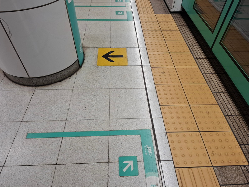
I am not entirely sure this sign is actually helpful to people with impaired vision, but at least it is equally useless to people from a wide variety of countries. I'm not sure what kind of dotcode this is (it is not a QR code, as is evident by the missing "eyes" used for determining QR code alignment and size), and my phone apparently can't read it.
-
Children usually pay half fare, in this case 120 yen. ↩
-
One of my older posts had correct transcriptions for all Japanese names, but it took me an hour or so to figure out an AutoHotKey solution that allowed me to type macrons without having to either copy them from a symbol table or memorize their Unicode values. I have changed computers since then and simply cannot be arsed to set up the same solution on my new machine. Ironically, typing macrons is really easy on Android! ↩
-
Actually four or so ↩
-
This is not legal advice. ↩
-
The sign refers to this as a 86 Series car. Different cars of a consist would have different series designations, but the whole train is usually referred to as the "80 Series". To some extent, this still applies today, e.g. JR East's E231 Series uses "E230" numbers for some types of car. ↩
-
This is discussed in "Birth of the Shinkansen: The Origin Story of the World-First Bullet Train" by Tetsuo Shimomae, ISBN 978-9811665387. ↩